The first time we reviewed this app, we were impressed. The graphics were amazing, and the idea of being able to look at a dive site in depth — no pun intended — and from all angles was innovative. Well, the team behind the Ocean Maps app team has made it even better. Only now they’re targeting a slightly different audience — dive professionals.
This doesn’t mean that recreational divers won’t get use out of the app; they absolutely will. Users can still do a virtual dive through a dive site, zoom in and view a site from all angles, as well as make personalized notes.
So, what’s new?
First, graphics have improved. App designers changed the style a bit to make it cleaner and sharper. The app also now includes more areas, over 70 sites mapped in Florida alone with in the works. (Hmm…I wonder if they need help with that…) In the Red Sea, a whopping 120 sites are ready to go. (See below for a full count of the mapped sites.)
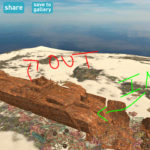
Aside from the improved graphics and dive-site additions, the biggest new feature is a dive-planning feature, the part that’s geared toward dive pros. We’ve all see the big whiteboard dive-site maps on boats or in dive shops, or even laminated printouts. Those are all well and good, but what if your guide could whip out a tablet and take you through a 3D-version of the dive site, showing you exactly where you’ll enter and exit a wreck, or where the octopus hides out? Imagine they can write directly on this virtual dive-site map and even share it with you or others on social media. Wouldn’t that be handy? Of course it would. And now they can do just that.


Dive pros can use tablets with full, actionable renderings of the dive sites for dive briefings and dive plans to make the briefing both more informative and more interesting to listen to so fewer minds will wander. Admit it, you’re guilty of it at times — I know I am. But I’d probably pay closer attention if the guide was taking me through a 3D model of the site. Plus, seeing it in real detail and knowing what to expect on a dive will make it easier for divers to understand the upcoming dive and stay safer.
Obviously, while the planning feature is geared toward pros, non-pros can easily use it for planning dives with a buddy, especially when diving in a new area without a guide.
Number of sites
More are coming online all the time, but so far here’s what you can access with Ocean Maps:
- 120 in Red Sea
- 70+ in Florida
- 19 in Cayman
- 10+ in Madeira
- 13 in Tarifa, Spain
- 15 in European Lakes
- 25+ in Palau
- 20+ in Yap
- 60+ in Philippines
- 20+ in Indonesia
App Features
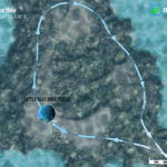
- Four viewing modes: Terrain, Natural, Depth, Dive
- Ability to do a virtual dive using on-screen controls
- Dive Planning Mode: write on the map, use multiple colors
- Sharing Feature: share your planned or completed dive to most social-media platforms
Though there aren’t many available yet, this app stands out from other dive-site app tools for all the reasons mentioned above. It’s not free, but it’s worth the few bucks it will cost you. As someone who’s gotten lost in the app spending hours “swimming” through dive sites I may never get to see in person, believe me — it’s worth the cost of the app even if you don’t use it for diving. Plus, you can buy the sites piecemeal, so you only get the ones you want. And finally, if you’re a dive pro or own a dive shop, definitely look into this app. It will make a world of difference for your dive briefings.
The post Review: Ocean Maps Revisited appeared first on Scuba Diver Life.
from Scuba Diver Life https://ift.tt/2MMzGX4
No comments:
Post a Comment